Wednesday, 23 April 2014

Sights set on Expotees


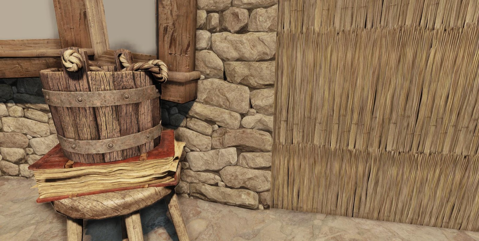
Old book


After finishing all of my other deadlines and taking a week off to go home it's now time to pick my FYP back up and get it ready for Expotees.

I asked a few peers, my tutor and people in the industry for feedback.  I'll be trying to make as many changes as possible before Expotees.

The first thing I need to work on is the book on the desk.  My tutor said that it was too small and thin so I went back in and made it thicker, more interesting and put a lot more tris into it.  It's currently just under 2,000.  I think I can spend a reasonable amount on the book as it really is a centerpiece to my scene.

Wednesday, 12 March 2014

Much Needed Update

I haven't updated my blog in a long time!  Basically I have just been cracking on, I've got a folder full of development screenshots which I just never ended uploading but I probably should put them up soon.

Here's a look at what it currently looks like.  There's a few things that I'm rushing to get done to fill in the gaps for the coming deadline, for example the fireplace, which I despise.  But I will use it as a placeholder and develop it further for my Viva and Expotees.

I've been having a mess on with the lighting too,  so that looks a bit odd, especially the projection of the coloured windows, and the overly saturated sun shafts.  I'm just really looking forward to getting in there after the first deadline and have more time to make some beauty assets, oh and redo the trees!


Saturday, 8 February 2014

Quick Update


IGNORE THE BLUE WINDOWS! It was just to make the shader.
Time to get a screenshot of my whole scene in here.  I made all the rafters and beams, placed 176 individual sticks for the ceiling in Max, I realised at the end I should have done this in UDK and saved it on a layer.  The ceiling has ended up being rather expensive.

The scene is not lit and there are no post processors applied apart from colour grading which I was messing around with.

 I have my actual structure pretty much there, I just need to do the fireplace, the door and the stairs.  Oh and texture the windows.

Also, it's looking really brown at the minute, I plan to add colour through the smaller assets and some ivy.


I have just been doing one or two small assets to take a break from the bigger ones.


A friend showed me the Shift tool in max, it will come in handy for my hand crafted assets.

Monday, 20 January 2014

Knald


I have just been doing some messing around in Knald with my base diffuse for my windows, I've yet to do the panes or dirty up the wood.  This is some powerful software, it's really going to be a great thing to use for my textures, especially the wood.

Looking at this I might go add some more tris to the top of the curved window, you can see the edges too easily.

Gloss Map Issues


I revisited one of my older assets to add a gloss map for the leather, I couldn't seem to get it working correctly, it added a whole misty looking shine to my asset.


All it took was adding a multiplier to the gloss map. It's looking a lot better now, but I just spotted an error in the diffuse which I'll have to go in and fix, it shouldn't take five minutes.

Thatch


I managed to finally find a base texture for my windows that I was happy with, it's a hand hewn wood texture that I have been modifying to use for the diffuse of my beams, windows and a couple of other assets.  I moved onto the windows and made a template to use for the flowers on the frames.  I'll either use an alpha in ZBrush or model in some geometry in 3ds Max and then bring it into ZBrush.


In the meantime I decided to get on with my tiling thatch texture.  I did some experimenting in 3ds Max to model the bundles of straw.  The thatch is not really seen much so I knew I didn't have to spend much time on it.

When I was trying to project my template onto my plane to begin using the 2.5D method I had used for my wall I had several problems with the old method I used in 4R2 not working in 4R6.


I had a hell of a lot of problems with ZBrush crashing when trying to perform best renders, it wasted a lot of my time.


After I finished the texture I popped it into UDK next to a couple of models with flat diffuse textures to check the colours were working together.


I then found I had a problem with the texture going a bit crazy at a distance, I think that the high detail of the texture might be an issue to be viewed at from a distance.  I'm still trying to figure out the problem and seeing if I can get around it.


Sunday, 5 January 2014

Christmas Break Continued...


Height Map


AO Bake


Shadow Map


Flat Diffuse


Gradient Map


Cavity Peaks Map


Cavity Valleys Map


(Maps merged together)


Normal Map


Once I got it all into PS I used ZBrush to produced a whole range of maps my editing lights, shaders and materials.

The next step after this was to get it tessellating in engine.


               After I had replicated what is on UDN this is what it looked like... needed some tweaking.


This was my first time touching materials in UDK that don't go beyond the standard maps so I roped my friend Will into help.  The issue was that the mesh would not deform very well, there just didn't seem to be enough tris.  I was using my normal map and I changed to my height map as the information on there is a lot cleaner and I thought it would be more suitable.
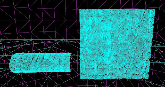


We turbosmoothed a plane and brought it back into UDK and the edges of the stones looked a lot better.

But I could see that my height map was maybe a bit too basic, it still looked flat even though the mesh was 3D so I went in and added a bit more contrast.

Will (http://willtparker.carbonmade.com/) also thought of a way to make more use of the tris by moving the verts around on the plane to correspond with the gaps between the rocks.


It was looking a lot better but the tri count was though the roof.

I had originally wanted dynamic tessellation where the triangles cut back the further away you are from the mesh but I was testing it and it just tore nasty holes in the mesh.  I watched a few tutorials and no one seemed to know away around it.  But after I changed the verts so that they followed the lines of the stone I quickly put it on and realised it had stopped tearing.


There's a little demo of the dynamic tessellation and the material. After I have got this working on my meshes in my scene and my fireplace I'll be moving onto my ceiling and the rest of the structure.